Lesson 1 - Drawing a Simple Room and
Moving the Camera Around
Note: This tutorial was written for Quake mappers. I have also created a
Quake2 version
and a
Hexen2 version of this same tutorial. Read that if you are doing maps for either of those
games. The content is the same; it's just the texture/entities/screenshots that have
changed.
If you haven't installed BSP
yet, go
here for instructions on
how to get it set up. Once you get it installed, run BSP and select 'Quake'
as the game you are editing. Once it's running,
click on the File Menu and select New. A blank map will be created.
Now, before we actually draw anything, let's get acquainted with
all the windows. Depending on your screen resolution, some windows may
be off the screen, so you may need to use the scroll bars to see them.
Here are the windows you should see:
- Top X/Y View - a view of your map from above
- Front X/Z View - view from the front
- Right Y/Z View - view from the side
- Texture browser - a graphical display of all the
textures in the texture wad you're using. Animated textures (ie.
buttons, slipgate textures, etc.) appear animated in the browser.
You can shut this option off if you need to, though.
- Entities - a list of monsters and other items
you can put in your map
- 3D View - a 3D wireframe representation of your
map - can be flat shaded or texture mapped with the click of a
button
- Groups - a list of groups you have created
- There's also a Surface window that can be toggled on and off with the 'S'
key. I'll cover it later on.
You can size these windows and position them anywhere you want.
I use 800 x 600 resolution and here's
a screenshot of how my editing window looks. That setup works pretty
well for me, but experiment around until you get comfortable.
Once you get the windows where you want them, you can
save that arrangement as the default by selecting the File menu and
clicking on "Save Window Arrangement". Another method is to
click the 'Save Window' button on the toolbar. When you do this, you
are prompted to enter a value from 1-4. This allows you to have 4
different window setups. I have only used 1, so I'm not sure why you
would want more than that, but if you do, the option's there.

The Save Window Button
Okay, once you get your windows where you want them, let's start making
a map. Switch over to the 'Top X/Y View'. You should see a plain black
window with a tiny red box in the middle. This red box is camera position 1.
There are five different camera positions you can set up. You can
change the active camera by right-clicking on the title bar of a 2D
window and selecting which camera to display from the context menu.
(I'll explain more about moving the camera positions later.) I also
find it helpful to have the grid turned on sometimes. If you don't
like it that's up to you. The grid can be toggled on and off by
clicking on the grid button.

The Grid Button
You'll also notice a button labeled '16' in the top
left corner of the 2-D windows. This is the current grid size. The
default in BSP is 16, but you can change it by clicking on the button
and selecting a new size. I find 8 is a better default and that's what
I use throughout my tutorials, so you may want to change your default
grid size to 8 before we start. You can set this under
'Preferences' on the File Menu. Be sure to click 'Save to INI' before
you exit the preference window if you want that to be the default next
time you use BSP.
In order to create a map for Quake, you have to
understand what a 'brush' is. Every item that you make is
composed of brushes. You can think of brushes as building blocks of
solid material which can be stacked, stretched or cut to make all
manner of interesting shapes. Put these blocks together and you can
build intricate, beautiful maps that are fun to play on. That takes
For now, just remember that a brush is solid (with a few execptions,
but we'll get into those in later lessons.)
Let's start out by drawing a room. First make sure the coordinates
(0,0) are visible in the Top X/Y View. If the grid is turned on, you can see the X
coordinates listed across the bottom of the window and the Y
coordinates listed down the left side. If 0 is not visible on each
axis, you need to move the camera position. Whenever you are in a 2D
window (X/Y, Y/Z, or X/Z), you can move the camera position by
right-clicking the mouse. Wherever you right click in the window, that
spot becomes the camera location and the view window is re-centered
at that location. Play around with it a little and see what I mean,
but when you are done, put (0,0) back in the center of the screen.
Okay, now left-click with your mouse at (-256,128) and
drag to (256,-128). The mouse position is shown in the status bar at
the bottom of screen. Don't worry if you don't get your mouse exactly
on those coordinates. BSP is set to snap to grid by default. As long
as you're close it should end up on the right spot. When you release
the mouse button a red rectangle appears. One side of this rectangle
will be yellow. Don't worry about that, it just means that side is the
currently selected side. We'll get into what that means later. If you
have trouble seeing your brush, remember you can toggle the grid
on/off to help visibility.
So we have a room that's 512 wide and 256 deep. But
how tall is it? Let's find out. Now here's another one my personal
preferences. You can look at the Front View and Right View by
selecting the appropriate window or you can do what I do. Stay in the
Top View window and click the 'Switch Map View' button to rotate through
the different views.

The Switch Map View button
Whichever method you prefer, switch to the 'Right
View' now. You're looking at the same rectangle you just drew, but now
from the side rather than the top. If your BSP is configured the same
as mine, your box is 80 units high. That's the default in BSP.
The player entity is about 48 units tall and most
monsters are taller than that, so 80 is a pretty short room. Let's
make it taller. Position your mouse pointer above the box. Click and
drag the mouse towards the top of the screen and the rectangle should
stretch in that direction. Drag the top edge of your rectangle up to
128. That's a nice size room to start with. Actually we don't have a
room yet - we have a brush (that's an important distinction). We'll
make it into a room after we texture it.
One thing you might be interested to know is that
whenever you draw a brush, you are dragging it in two dimensions. BSP
gets the 3rd dimension from whatever that dimension was on the last
brush you drew. In this case, if we were to draw another brush in the
X/Y view, the height will be set automatically to 128, since that was
the Z dimension of the last brush we manipulated. This also works if
you draw a brush in the X/Z view or the Y/Z view. Whatever dimension
you can't see is set to that same dimension on the last brush you
changed/drew. That's a handy feature if you are drawing a lot of
brushes and want them all to be the same height. I just put that in
here in case you were wondering where that 'unknown' dimension comes
from. Whenever you are in a 2D view, the current 'Height' of the 3rd
dimension is displayed in the status bar, along with where the 'base'
of that brush will appear in the 3rd dimension.
Switch over to the texture browser window now. Select whatever texture you want
to appear on the walls of your room. I used 'Tech11_1' in my map.
You can also select a texture by clicking on the drop
down box in the texture window (or on the toolbar) or by scrolling down the texture
browser with the scroll bar. Click on a texture you want on the walls
and a box will appear around the texture to indicate it is
selected.
Once you've picked the texture you want, hit ALT-B
to apply it to your brush. The other alternative is to select Edit |
Set Texture | Set Brush Texture from the menu, but as you can see,
ALT-B is easiest.
If you are used to Doom editing, then you might
think you just created a room, but remember what I said earlier about
brushes? What you've actually created is a solid block (a brush). Now,
it's kind of hard to walk around inside a solid brush, so it's time to
make it into a room. Switch back to the 'Top X/Y view', if you're not
already there. On the toolbar, you should see a 'Make' button. In the
drop-down list next to this button, select 'Room' and then click on the
'make' button. You should see a
dialog box asking for a wall thickness. Enter 8 (it should already
show this if you have 8 set as your grid size). If you don't want to
see this dialog box, clear the 'Query Wall Width' option on your
'Preferences' page and then when you create a room the walls will be
set to the thickness equal to the current grid size.
You should now see that each side of your rectangle has
become a rectangle of its own. Each of these rectangles is a separate brush
and the area enclosed by these brushes is your 'room'. Don't believe
me? Switch to the 3-D view window and let's walk around inside.
When you first switch to the 3-D window, you should
be looking at a bunch of colored lines with little squares in the center of
each line. If you haven't moved your camera around too much, you're
actually positioned in the middle of your room and those red lines are
the walls. You can move around in the 3-D window by using the
following keys:
- {uparrow} - move forward
- {dnarrow} - move backward
- {leftarrow} - turn to the left
- {rightarrow} - turn to the right
- {alt-leftarrow} - sidestep left
- {alt-rightarrow} - sidestep right
- {shift-uparrow} - move up
- {shift-dnarrow} - move down
- {pgdn} - look up
- {del} - look down
- {pgup} - to reset your view
Take your time and move around a while to get
comfortable with using these keys. The distance you move with each
keypress is customizable under the 'Preferences' selection on the File
Menu, so if you want to change it, you can. When you're done
experimenting, position yourself back in the center of your room.
By the way, if you're wondering what that little
circle/arrow in the top right of the 3-D window is for, I'll tell you.
That is the angle you are currently facing in the 3-D preview.
Clicking anywhere on the circle will move the arrow to that location
and turn the viewport to face that direction. That's handy for quickly
turning to look the opposite direction.
This 3-D wireframe is nice, but it doesn't really
let you know how your room will look when you play it. For that you need to
turn on the texture preview option. This can be done by clicking on
one of the three 3-D view buttons or by selecting 'Render' from the
Display menu. The buttons are easiest, so that's what I recommend.

3-D rendering buttons
The first button (currently selected) is the 3-D
wireframe you are currently seeing. The second button renders your map
in flat-shaded mode. The third button renders your map in full texture
preview. That's the coolest of the three modes, but it requires a lot
of computing horsepower. Generally, if you can play Quake, your
computer can handle the full texture preview mode, so go ahead and
click on the third button.
Now move around and look at your room again. You
can still move the camera around the same way as you did before, it
just is a little slower. If you looked at my setup earlier, you notice that
I have the 3D window in the upper-left corner of my screen. With this
setup, I can see the 3D window as I add brushes in the 2D view and see the
results immediately. That's one advantage of that particular setup.
If you want, you can set BSP to lock your cameras so that when you move in the 2D view,
it updates the 3D view and vice versa, or you can leave them unlocked, which is the default.
I prefer unlocked, since that allows me to set a 3D camera position and then
move around the 2D windows while still seeing that location in 3D. To lock
the camera, right-click on the title bar of a 2D view and select Camera/Lock Cameras.
Well, by moving around your map, you can see right away that the floor and
ceiling are the wrong texture, so let's change them to something else.
Currently, all the brushes in your room are outlined, meaning
they are 'selected'. Any textures you apply will be put on all the
selected brushes. We only want to change the ceiling for now, so hit
the {esc} key to deselect all brushes. You may notice that there are
still outlines around your brushes, but they are a different color.
This is because in the Textured Preview, BSP shows you the wireframe
edges superimposed on the textured view, just so you can see where the
edge of each brush is. If you don't want to see this (like me), click
on the Outline button to turn it off.

Outline button
Now move your camera around until you can see the
ceiling brush in the 3D window. Click your mouse on that brush. The
ceiling brush should become outlined in red - actually it may appear
yellow if the currently selected side is facing you. That's okay, it's
still selected.
At this point, you could switch back to the texture
browser window and pick an appropriate ceiling texture, but remember there's
another way. Look in the toolbar and you should see a drop-down list
that shows the texture on the brush you have selected.
Drop this list down and select a texture for your ceiling. I used 'Ceiling5'
in my map. Then apply it to your brush with ALT-B.
The floor needs changed too, so either click on the
ceiling brush again to deselect it or hit {esc} which deselects all
brushes. Select the floor brush by clicking once on it. Pick a texture you
like (I used 'Floor01_5') and apply it to the floor. Do it the same way you changed the
ceiling texture. Notice that you are doing all this from within the 3D
texture view so you can look at your room as you change it. Cool, huh?
That look's a little better, doesn't it? If you
don't like the textures I've chosen, feel free to play around and
change them to whatever you want. The only thing I ask is that you
don't put any 'sky' textures on the ceiling. We'll be putting a window
in there later and we'll use the sky at that time.
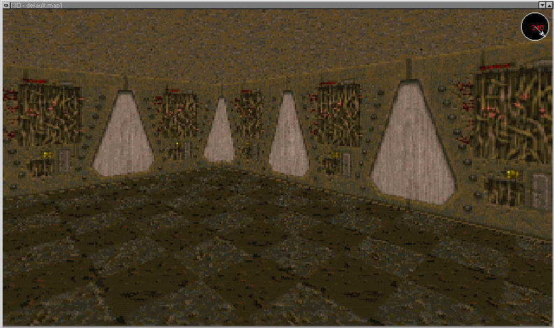
Here's what our level looks like so far:

We're almost ready to compile and test our level,
but first we have to add a starting position. Without it, your map won't
run.
Switch back to the Top X/Y view and hit {esc} to
deselect all the brushes. Depending on where you ended up after moving around
the 3D view, you may have to move the camera around in order to make your
room show up in the Top X/Y view window. Do that now.
In order to make the starting position, let's draw
a box from (192,64) to (224,32). The exact size doesn't really matter,
because when we turn it into an entity, it will size itself since the
player start entity is a fixed size. Once you've drawn your brush, hit the 'E' key
to switch to the 'Entity' Window.

Drop down the listbox (it currently says
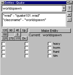
'Worldspawn') and select 'info_player_start'. Once this is selected,
click on the button labeled 'Make Entity' and voila, you've created a
player starting position. Easy, huh? You can control the direction
your starting position is facing by selecting one of the numbers (0,
45, 90, etc.) in the Entity window. Let's select 180 for now, to make
the player face West. You have to do this after you create the entity,
not before. If you click the angle button before the entity is
created, it won't work.
One other thing we need to check is to make sure
our player is standing on the floor. Switch to either the Right or
Front view and make sure the bottom edge of your brush is sitting
against the top edge of the 'floor' brush. You may have to toggle the
grid off to see all the lines. You don't want it to be above the floor
because then you'll appear in midair. You also don't want to be
'inside' the floor brush, since you'll be stuck and unable to move
when you first spawn. Check the position of your brush and if you need
to move the brush up or down, simply position the mouse cursor inside
the brush, left-click and drag the brush around until you get it
positioned where you want it. In this case we want the bottom edge of
the brush to be at 0 on the Z axis.
Got it? Great! Now we're ready to save the map and
compile it. Select 'Save As' under the file menu and name your map
'lesson1.map'. Make sure it is saved in the proper directory (wherever
you set up your map directory when you installed BSP) and
click on 'OK' to save your map.
Now we're ready to compile. Fortunately for us, BSP makes it easy to test our
map. Simply select 'Full' from the Export menu. BSP will ask you if
it's alright to save your map. Go ahead and click
'Yes'. An MS-DOS window will appear and your level will be compiled,
lit, and vis-ed. If you want to know in detail what's going on now,
check out my notes on
compiling
your level. Assuming everything is configured properly, your level
should compile and run in whatever game you are editing. If something goes
wrong, review the lesson and make sure you did everything just as I
described it. If that still doesn't work, read this page of
troubleshooting notes.
Did it work? If so, you should find yourself
standing in your room. Since we haven't done any custom lighting yet, your level
is lit in fullbright mode, but the important thing is you've
created a map and are playing it. Cool, huh?
Run around, look up, look down, do whatever you
want. It's your map after all. When you're done looking over your map,
exit Quake and return to BSP.
Well that wasn't so bad was it? What do you say we
take a break? So far we've accomplished quite a bit in learning the
basics of BSP, but we've just scratched the surface of what this
editor can do. Future lessons will get deeper into what you can do,
including lighting, clipping and advanced texture handling. Enjoy!
This site is designed for 800x600 resolution, and is best
viewed in Netscape 4.0 or above with 16bit color or higher.
BSP is the sole creation of
Yahn Bernier. I am only a
dedicated user, reporting news and making tutorials so Yahn can spend more
time enhancing BSP.
This web page was created and is being
maintained by me (DeadMeat). Unless otherwise noted, all content appearing on this site
was written by me. Also, 'DeadMeat's BSP Tutorials' were created entirely by me. All unauthorized use is
prohibited. (c) 1997. So there :-P
